About six months ago I came to the realization
that I was not completely satisfied with the look and feel of my website.
Granted, I felt it contained a lot of valuable information, however I felt that
there were a few elements that were missing. Firstly, I felt that the old
website was not personal enough, and I was coming off bigger than I truly was.
I also wanted to convey my new focus better as a practice that specializes in
cloud-based bookkeeping using Xero and other applications.
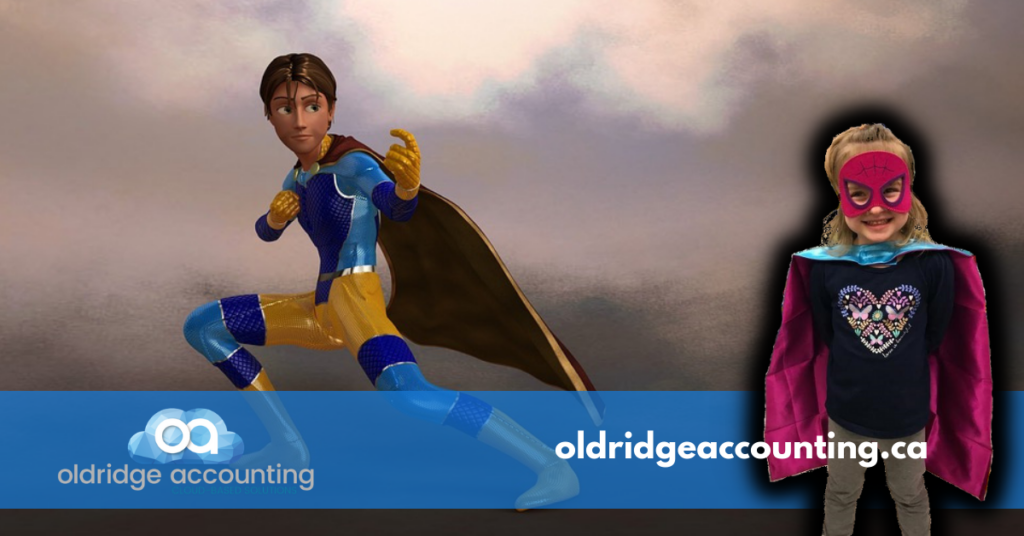
At first, I tried building a new website myself, I was happy with most of the content that I created, but I felt like that I did not have the right look or expertise to make everything look professional and pop off the screen. I ended up hiring Russtek Media to revamp the look and feel of the website. I wanted to come across as an accounting superhero and include some personal touches such as a picture of my oldest daughter in her superhero costume. I also wanted to include my professional head-shot, so people could see that face of the business.
Some new elements that I have now included on
the site include testimonials from clients, a frequently asked questions page
and a technology page.
I have also included more call to actions to make it easier for potential
clients to get in touch with us. There will also now be a sign-up option for our newsletter. I
really like the new website as my message is coming across the way I want it to
be conveyed.
Have you singed up for our news letter yet? Be sure to here…

How are you avoiding burning out?
First, I would like to say Happy New Year to everyone that follows my blog! It has been a while since I last wrote a


